

September 15, 2015
AGENCY BUILDS VISUAL IDENTITY FOR FABIO VIVIANI
September 9, 2015 by Jeff Fleischer
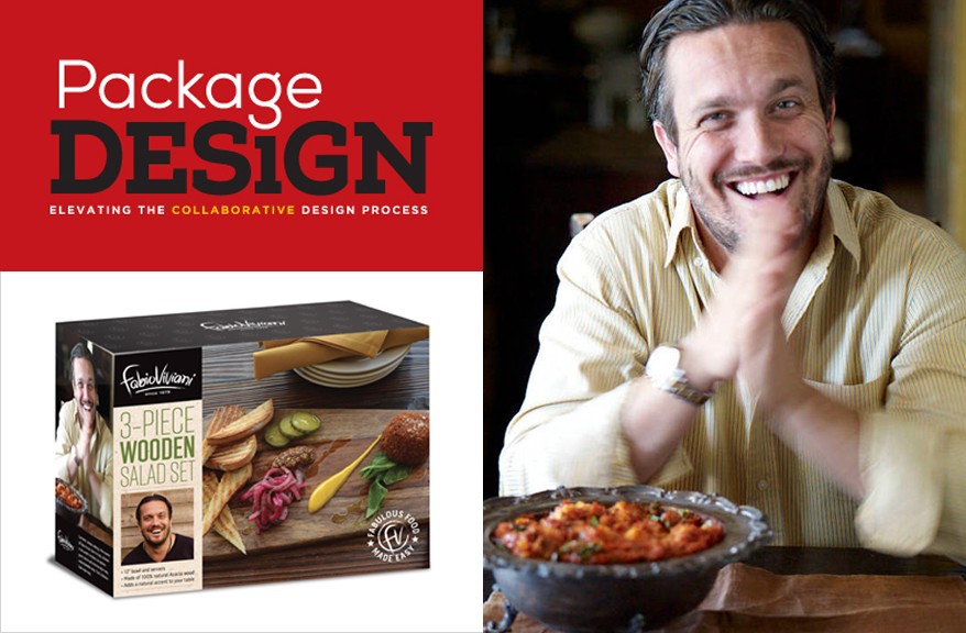
Celebrity chef and television personality Fabio Viviani wanted to bring his charismatic personality and approach into homes, with a series of new products with a brand identity that matched Viviani’s sexy personality and approach to cooking.
“The importance of the brand voice for a celebrity brand extension is so important, even more so than for a different kind of new product,” says Maryann Mitkowski, vice president and director of creative services at Parham Santana, the branding agency that worked with the heartthrob chef and his licensing agency, the Joester Loria Group. “In other cases, you can focus on the product. With a celebrity, there’s a person behind the brand who the consumer is being asked to trust. It’s important their unique voice comes across.”
Sense of style
The collaborative team developed a style guide and branding elements that could apply across a range of products and packaging. The first step in translating Viviani’s style was a “visual interview” with the chef, which allowed Parham Santana to determine which visuals from a sampling of colors, photographs, and other elements fit his visual identity.
“Visually, he was clear he loved big, bold typography,” Mitkowski says. “He loves the color black. As with his food, he loves a rustic look. The food had to look rustic and sumptuous.”
Viviani already had some branded products on the market, including cookbooks, an online newsletter and more. However, the licensing agency wanted future products to have a different aesthetic and tasked Parham Santana with creating a style guide and brand essence with a set of new, distinct elements. One thing they did repurpose was a monogram. Parham Santana created a somewhat similar “FV” monogram and enclosed it in a circle for one logo. Another element is a seal that surrounds that monogram with the text “Fabulous Food Made Easy” in all-capital letters.
Getting personal with shoppers
Another branding element features the chef’s name in lowercase letters, with the tagline “Since 1978,” the year he was born. That element appears at the top of all packaging, in white lettering against a black field. The style guide also includes about a dozen quotes from Viviani that showcase his personality, such as, “It’s better to eat rich than to die rich,” “If God wanted us to follow recipes, he wouldn’t have given us grandmothers,” and “Those who forget the pasta are condemned to reheat it.” Those quotes appear on the packaging for some products.
“Many of the programs we've done have been supported by taglines or brandlines that sum up the essence of the brand,” says John Parham, president and director of branding at Parham Santana. “Once you find the right words and the right phrase, it’s easier to understand if the visuals are supporting that or not.”
Ready to serve
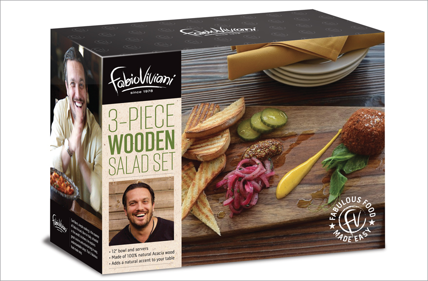
The first Fabio Viviani products using the new branding rolled out early this year, including a Fabio Viviani Heritage Collection line of servingware developed with Picnic Time, as well as cookware. This servingware was already in development before the branding was complete, and includes breadboards, cheeseboards, nesting bowls, cookbook stands, and other items, many made of acacia wood.
The branding uses two photographs of the chef, provided by Viviani. One is a headshot of him in a black shirt, looking at the camera and smiling. The other shows him sitting at a table, smiling with his hands in front of him. The headshot appears on all products in the launch, while the seated shot is also used on the side panel of the servingware boxes.
For example, the package for the wooden salad set has a photo of the servingware holding several food items on the front panel, with a left-hand column featuring the chef’s name element on top, then the product name, and Viviani’s headshot at the bottom. The background of the column uses a craft-paper look that Parham Santana developed as part of the branding, to give the packaging a rustic quality. Other panels have text in white on black background, including “Fabio Fun Facts” and some tips for salad preparation. The top panel uses a black background with the chef’s initials in greyscale pattern and the name logo prominently centered in white.
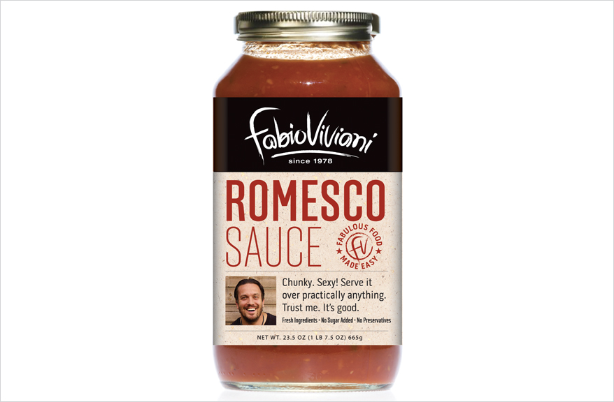
Similarly, the sauce jars make use of the craft-paper look on the banded label. The top has the name logo against a black background. The product name appears in all capital letters in a warm red, and below it sits a headshot of Viviani next to a quote from the chef.
Eager to share
“We wanted to ensure that the packaging is an extension of Fabio’s personality and worked well across the categories we planned to develop for Fabio,” says Debra Joester, president and CEO of the Joester Loria Group. “Fabio is warm, vivacious, accessible and eager to share his love of food and food preparation with people. His philosophy is that cooking should be fun and easy.”
While the logos often appear in black-and-white, other text on the packaging makes use of warm greens and reds. Born in Italy, Viviani originally learned to cook from his grandmother, and that rustic approach to cuisine is part of his appeal. So the style guide Parham Santana created established guidelines for how the food is presented photographically. Though Viviani is an Italian chef, he also trained in other parts of the world, and his cuisine is international, so Parham Santana created a look designed to work for Italian food without being too specific.
“It really showcases the product on the packaging,” Joester says. “These elements fit together very nicely, so it really pops off the shelf. If there are a number of SKUs, this way they fit together nicely.”
The branding process took about six to eight weeks from the visual interview until the completion of the style guide, and the branding was designed to be flexible, so that it could be used on any future executions.
The servingware featuring the new branding rolled out at Nordstrom, as well as specialty retail stores. Additional products with this branding are planned for a 2016 launch, including a line of knives and other food-preparation items. Viviani also continues to work with several food companies as an endorser.
